New Brand Unveiled at Annual Conference
CAPIO's Taking Members to New Heights
CAPIO was excited to unveil its new brand at our conference in April. As we all know, the world around us is changing. The demand for information is at an all-time high, and attention spans are at an all-time low. We’re in an era where meaningful community engagement has to be carefully balanced with powerful outside pressures. Communication is moving faster than ever, meaning what’s worked for us in the past won’t continue to work in the future.
Since 1971, CAPIO has been the leader in advancing public sector communicators, and we’re now ready to take our membership to new heights. Just as communications is ever-evolving, CAPIO is evolving to meet its members’ needs. Through trainings, networking, mentorships, accreditations, and so much more, we’re taking flight together.
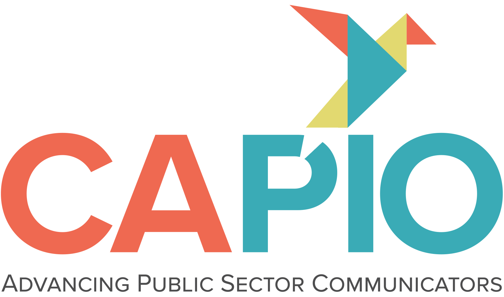
CAPIO’s new brand was the creative work of JPW Communications. The color palette is inspired by the beauty of California, and the mark uses more sophisticated tones than CAPIO’s old logo. The new coral, blue, and chartreuse depict the richness of our topographic diversity across our great state.
The mark itself purposefully uses all capital letters to spell out CAPIO, moving away from the past lowercase letter application as a way of symbolizing and recognizing the strength of CAPIO as it boldly moves forward.
The geometric bird is the result of a visual exploration of direction, advancement, and arrows—all part of the new CAPIO brand platform. Birds have also long been a recognized symbol and carrier of communications: from the saying “a little birdie told me,” originating from the days of messenger and homing pigeons carrying critical news, to today’s easily identifiable Twitter symbol. It’s clear that birds continue to have unmistakable meaning and connection for communicators.
Also significant—the bird symbol pierces the P in PIO: first, signifying both its point of origin and its launching pad into the world—much like the stories communicators create and release; and secondly, representing PIOs taking flight thanks to their involvement with CAPIO.
As the shapes come together and ultimately form something greater than the sum of their parts, we felt that dynamic was resonant of CAPIO as a professional collective, eloquently illustrating the work that each of our CAPIO members do daily—collecting facts and transforming them into cohesive stories that are meaningful and significant for the many, varied communities we serve.
Finally, the mark is also beautifully symbolic, telling a complete story and showing both the strength of CAPIO and the strength of diverse, personal, and professional perspectives coming together.

